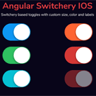
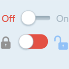
Angular Switchery IOS
Description
This package is an angular based component that helps you use beautiful switchery controls WITHOUT any external JavaScript dependency. Number of customizations are available to suit your needs including colors, sizes, labels & positioning.
Supported by all modern browsers: Chrome, Firefox, Opera, Safari, Edge, IE9+

Installation
To install this library, run:
$ npm install angular-switchery-ios --saveConsuming your library
You can import library in Angular AppModule by the following method:
import { BrowserModule } from "@angular/platform-browser"; import { NgModule } from "@angular/core"; import { AppComponent } from "./app.component"; import { NgSwitcheryModule } from "angular-switchery-ios"; @NgModule({ declarations: [AppComponent], imports: [ BrowserModule, // Specify your library as an import NgSwitcheryModule ], providers: [], bootstrap: [AppComponent] }) export class AppModule {}Once your library is imported, you can use Switchery in your Angular application:
Usage
Settings and Defaults
color: color of the switch element (default is primary, switchery-info, switchery-success, switchery-warning, switchery-danger)size: size of the switch element (switchery-lg, switchery-sm, switchery-xs)disabled: you can enable/disable states the state of the switch by adding disabled property (boolean value)onLabel: specify label for your switchoffLabel: specify label for your switchsticked: position your switch to stick to right (boolean value)
Examples
Default
<!-- Default Switch --> <ng-switchery [(ngModel)]="truthyValue"></ng-switchery>Template Driven Froms
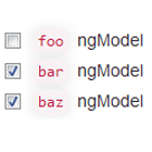
Using ng-switchery withing a template driven form or with NgModel
<!-- Template Driven Form --> <form #form="ngForm"> <ng-switchery [(ngModel)]="truthyValue" name="switchery-check"></ng-switchery> </form>Reactive Forms
Using ng-switchery within a Reactive Forms
<form [formGroup]="reactiveForm"> <ng-switchery formControlName="value"></ng-switchery> </form>Disable
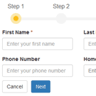
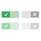
Enable/Disable states by adding disabled property
<!-- Checked Disabled --> <ng-switchery [(ngModel)]="truthyValue" disabled onLabel="Checked Disabled"></ng-switchery> <!-- Unchecked Disabled --> <ng-switchery [(ngModel)]="falsyValue" disabled onLabel="Unchecked Disabled"></ng-switchery>Colored
Change the default color of the switch to fit your design perfectly. According to the color system, any of its color can be applied to the switchery.
<!-- No class specified --> <ng-switchery [(ngModel)]="truthyValue" onLabel="Checked in Primary"></ng-switchery> <!-- color = switchery-info --> <ng-switchery [(ngModel)]="truthyValue" onLabel="Checked in Info" color="switchery-info"></ng-switchery> <!-- color = switchery-success --> <ng-switchery [(ngModel)]="truthyValue" onLabel="Checked in Success" color="switchery-success"></ng-switchery> <!-- color = switchery-warning --> <ng-switchery [(ngModel)]="truthyValue" onLabel="Checked in Warning" color="switchery-warning"></ng-switchery> <!-- color = switchery-danger --> <ng-switchery [(ngModel)]="truthyValue" onLabel="Checked in Danger" color="switchery-danger"></ng-switchery>Sized
Choose one of 4 main Switch sizes - large ( .switchery-lg), default, small ( .switchery-sm) and mini ( .switchery-xs). Just add proper size as input.
<!-- size = switchery-lg --> <ng-switchery [(ngModel)]="truthyValue" onLabel="Large in size" size="switchery-lg"></ng-switchery> <!-- No size specified --> <ng-switchery [(ngModel)]="truthyValue" onLabel="Default in size"></ng-switchery> <!-- size = switchery-sm --> <ng-switchery [(ngModel)]="truthyValue" onLabel="Small in size" size="switchery-sm"></ng-switchery> <!-- size = switchery-xs --> <ng-switchery [(ngModel)]="truthyValue" onLabel="Mini in size" size="switchery-xs"></ng-switchery>Labels
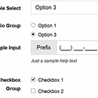
Switchery can be used with single label or with multiple labels. For single label use onLabel="Single Label", for double specify an extra property offLabel="Double Label"
<!-- Specify onLabel --> <ng-switchery [(ngModel)]="truthyValue" onLabel="Single Label Switch" ></ng-switchery> <!-- Specify both onLabel & offLabel --> <ng-switchery [(ngModel)]="truthyValue" onLabel="Option 1" offLabel="Option 2"></ng-switchery>Right Sticked
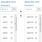
Sometimes it's very useful to have switches on the right side of the container. Just add [sticked]="true" to the Switchery
<!-- Set sticked = true --> <ng-switchery [(ngModel)]="truthyValue" onLabel="Option 1" sticked="true"></ng-switchery>


