skdslider
SKDSlider - Full Width Jquery Slider - Jquery Responsive Full Width Slider - Full Screen Slider- Simple Jquery Slider
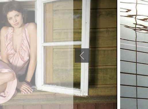
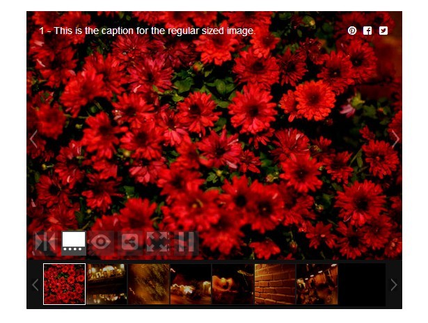
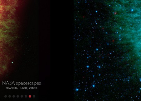
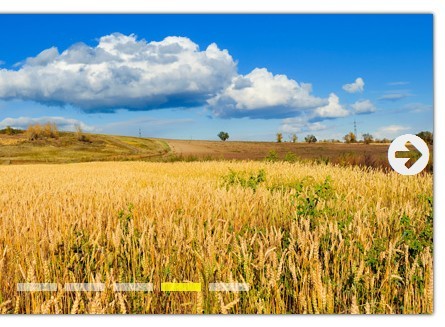
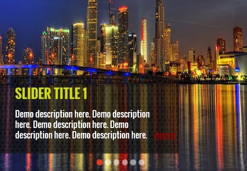
Demo
http://dandywebsolution.com/skdslider/
How to use?
markup
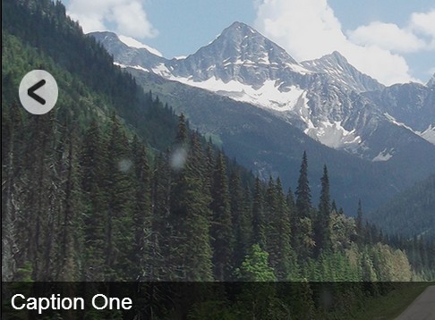
<link href="skdslider.css" rel="stylesheet"> <script src="skdslider.min.js"></script> <div id="demo1"> <div class="slide"> <img height="285" src="slides/1.jpg" /> </div> <div class="slide"> <img height="285" src="slides/2.jpg" /> </div> <div class="slide"> <img height="285" src="slides/3.jpeg" /> </div> </div> Javascript
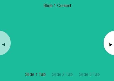
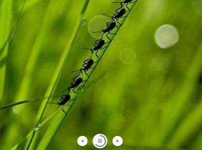
$('#demo1').skdslider({ slideSelector: '.slide', delay:5000, animationSpeed: 2000, showNextPrev:true, showPlayButton:true, autoSlide:true, animationType:'fading' }); Available options are:
| Option | Description |
| slideSelector | Define your slide css selector. Default selector: .slide |
| activeClass | Define what class would be set as active class to the active slide. Defaul class name: active |
| delay | Delay duration between two slides in micro seconds. Example: 5000 |
| animationSpeed | Fading Speed in micro seconds. Example: 2000 |
| animationType | fading/sliding - Default value is fading. |
| showNav | true/false - Default value is true. It will show/hide navigation icon |
| numericNav | true/false - Default value is false. If true, navigation will be numeric |
| autoSlide | true/false - Default value is true. Automatically start slideshow |
| showNextPrev | true/false - Default value is false. Either it will show next/prev button or not |
| showPlayButton | true/false - Default value is false. Either it will show play/pause button or not |
| pauseOnHover | true/false - Default value is false. Pause sliding on mouse hover |
| stopSlidingAfter | Default value is false. Other allowed values are 'all', 1,2,3.. If this properties is set, sliding will automatically stop at the specified slide |
| onMarkup | It is a hooking function and will be invoked just before UI is generated. So it is possible to modify ui like navigiation layout without modify core file. (example: coming soon...) |