React-Native List Popover
Popover is a great way to show a list of items for users to choose from. With component you can add a very simple pop over screen with a list of items as the child component and access the selected item from the parent component. It is a very easy way of adding a list of options to the UI.
The main properties to send from the parent component:
listlist of items to choose fromisVisibleindicator that makes the popover visible or notonClickcallback function that takes anitemparameter to handle the click operationonClosecallback function to set the isVisible to false to close the popover
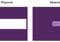
Screenshots
| Before | List Popover | Selected |
|---|---|---|
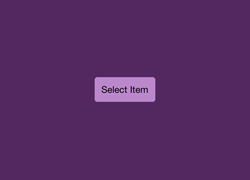 | 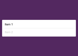 | 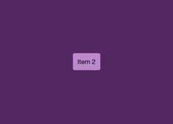 |
Usage
import React from 'react'; import {StyleSheet, Text, View, TouchableHighlight} from 'react-native'; import ListPopover from 'react-native-list-popover'; const items = ['Item 1', 'Item 2']; export default class App extends React.Component { constructor(props) { super(props); this.state = { isVisible: false }; } render() { return ( <View style={styles.container}> <TouchableHighlight style={styles.button} onPress={() => this.setState({isVisible: true})}> <Text>{this.state.item || 'Select'}</Text> </TouchableHighlight> <ListPopover list={items} isVisible={this.state.isVisible} onClick={(item) => this.setState({item: item})} onClose={() => this.setState({isVisible: false})}/> </View> ); } } const styles = StyleSheet.create({ container: { flex: 1, alignItems: 'center', backgroundColor: '#532860', justifyContent: 'center', }, button: { backgroundColor: '#b8c', borderRadius: 4, marginLeft: 10, marginRight: 10, padding: 10, }, });


