Pickli
jQuery Plug-in - Carousel Picker for li tags
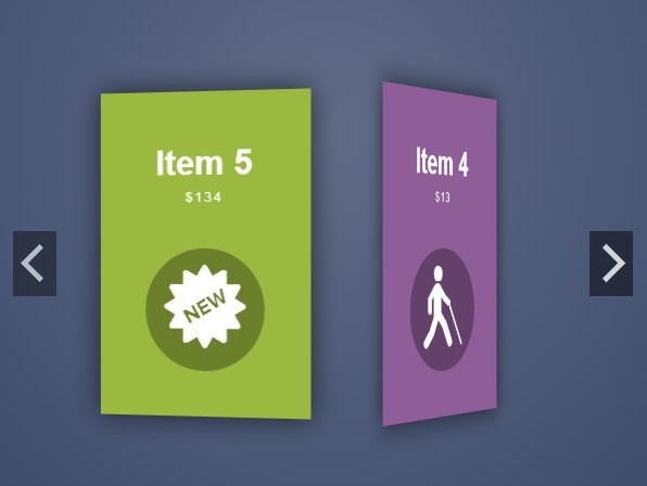
See exemples at http://molosc.github.io/pickli
Features
- Carousel Picker for list.
- Horizontal or vertical orientation.
- Align on left / center / right or top / medium / bottom.
- Custom class for selected and unselected items.
- Responsive with
onResizeevent. - Custom data key.
- Call data with ajax.
- Interactivity with custom events and cursor.
- Animated change with custom transitions.
Written by: R. Romain - http://molosc.com
License
Released under the MIT license - http://opensource.org/licenses/MIT
Let's get on with it!
Installation
Step 1: Link required files
First and most important, the jQuery library needs to be included. Next, download the package from this site and link the Pickli Javascript file.
<!-- jQuery library --> <script src="http://code.jquery.com/jquery.min.js"></script> <!-- Pickli Javascript file --> <script src="jquery.pickli.min.js"></script>Step 2: Create HTML markup
Create a <ul> element, with a <li> for each item. An item can contain any HTML content and need a value attribute.
<ul> <li value="1">Item 1</li> <li value="2">Item 2</li> <li value="3">Item 3</li> <li value="4">Item 4</li> </ul>Step 3: Call the Pickli
Call .pickli() on target <ul>. Note that the call must be made inside of a $(document).ready() call, or the plugin will not work!
$(document).ready(function(){ $('ul').pickli(); });That's all !
But you can configure Pickli a lot. See exemples at http://molosc.github.io/pickli
Configuration options
Data
default The default selected value.
default: null options: string index The selected index.
default: -1 options: integer value The selected value.
default: null options: string labelKey The key used for the label in data collection.
default: 'label' options: string valueKey The key used for the value in data collection.
default: 'value' options: string autoErase If true, empty the slider when data is updated. If false, merge data with current collection.
default: false options: boolean (true / false) data A collection of data (label / value) to fill the slider.
default: [] options: array ([{label:"Item 1",value:1}, {label:"Item 2",value:2}, ...]) remote Options for ajax data load. (See the Remote configuration options)
default: Remote options options: object (Remote options) Aspect
orientation Display the slider horizontaly or verticaly.
default: 'horizontal' options: string ('horizontal' / 'vertical') size If orientation == 'horizontal', size will affect width wrapper property. If orientation == 'vertical', size will affect height wrapper property.
default: '100%' options: string (width or height css value) selectAlign Alignment of selected item. If orientation == 'vertical', use 'left' for top, 'center' for middle and 'right' for bottom.
default: 'center' options: string ('left' / 'center' / 'right') unselectAlign Alignment when no item is selected. If orientation == 'vertical', use 'left' for top, 'center' for middle and 'right' for bottom.
default: 'center' options: string ('left' / 'center' / 'right') wrapperClass A class name used for the <div> wrapper.
default: 'pickli' options: string selectClass Class name of the selected item.
default: 'active' options: string unselectClass Class name of the unselected items.
default: '' options: string autoResize Refresh the position slider on window resize.
default: false options: boolean (true / false) Interactivity
interaction Mouse or Touch Events for select an item.
default: 'click' options: string transition How animate the slider when the selection change. If false, desactive animations. (See the Transition configuration options)
default: Transition options options: object (Transition options) cursor The cursor used on the slider.
default: 'pointer' options: string (A CSS cursor value) loop If true, clicking "Next" while on the last item will transition to the first item and vice-versa.
default: false options: boolean (true / false) Callbacks
onChange Executes immediately after a item is selected (or unselected)
default: null options: function(value){ // your code here } arguments: value: value of the selected item (string) onFill Executes immediately after the data collection change.
default: null options: function(data){ // your code here } arguments: data: current data collection (array) Remote options
Used for call a json data file or service with ajax.
How use it ?
You can load data when you initialize the slider:
slider = $('#target').pickli({ remote: { url:'http://...', ... } });Or latter with the public method:
slider.remote('http://...'); // or slider.remote({ url: 'http://...', type: 'GET', ... });Options
url The url used for load JSON data.
default: '' options: string type The type of request to make
default: 'GET' options: string ('POST' / 'GET') data Data to be sent to the server. (see the jQuery.ajax() documentation)
default: null options: string or object or array crossDomain If you wish to force a crossDomain request on the same domain.
default: false options: boolean loader A jQuery object witch will be occulted or visible when data are loaded. loader.show() when dispatch onRemoteStart, loader.hide() when dispatch onRemoteSuccess or onRemoteError.
default: null options: jQuery object Callbacks
onRemoteStart Executes immediately before the data ajax call.
default: null options: function(){ // your code here } onRemoteSuccess Executes on jQuery ajax success event.
default: null options: function(data){ // your code here } arguments: data: loaded data collection (array) onRemoteError Executes on jQuery ajax error event.
default: null options: function(data){ // your code here } arguments: e: error (object) Transition options
If you set the transition to false, it will desactivate the animation.
Options:
duration A string or number determining how long the animation will run. (see jQuery.animate documentation)
default: 'normal' options: integer or string ('slow' / 'normal' / 'fast') easing A string indicating which easing function to use for the transition. (see jQuery.animate documentation or http://api.jqueryui.com/easings/ for the list of easing)
default: 'swing' options: string ('linear' / 'swing' / 'easeInQuad' / 'easeOutCubic' / 'easeInOutQuart' / ...) Callbacks
onTransitionStart Executes on jQuery animate start event.
default: null options: function(){ // your code here } onTransitionComplete Executes on jQuery animate complete event.
default: null options: function(data){ // your code here } Public Getter / Setter methods
Each option have a getter / setter public function. (except for the orientation)
Public methods
next Select next item. Do nothing if there is not item selected.
example: slider = $('#target').pickli(); slider.next(); prev Select previous item. Do nothing if there is not item selected.
example: slider = $('#target').pickli(); slider.prev(); first Select first item.
example: slider = $('#target').pickli(); slider.first(); last Select last item.
example: slider = $('#target').pickli(); slider.last(); jump Jump to an item adding o substracting a value to the current index. Do nothing if there is not item selected.
example: slider = $('#target').pickli(); slider.jump(-3); refresh Refresh the slider with the current selection.
example: slider = $('#target').pickli(); slider.refresh(); For the next versions
- Add Getter / Setter for the orientation mode
- Add options by data tag attributes
Changelog
Version 0.0.2
- Add comments and documentation
Version 0.0.1
- Add vertical feature
Version 0.0.0
- First commit