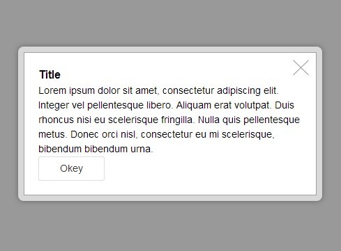
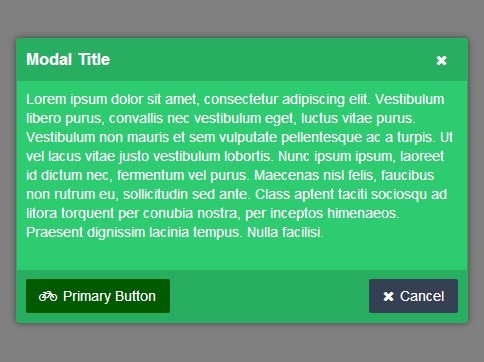
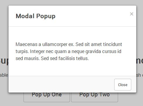
Simple Modal/Popup for inline elements
How to use this plugin
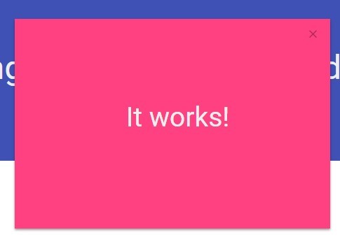
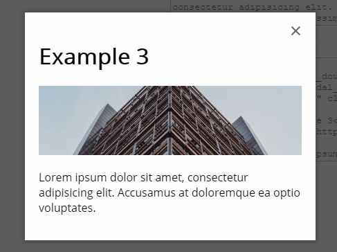
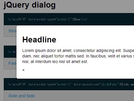
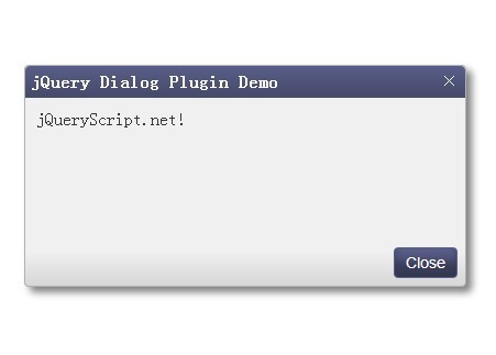
1. Create markup (Inline)
div.modal__wrapper.is-hidden (Add any custom class for themes e.g. .modal__wrapper--default-theme) div.modal__double.js-modal__double 2. Inside of the two div you can do your magic.
div.modal__content 3. Place the close button if needed
a.modal__close.js-modal__close 4. Add custom class for the main wrapper to attach the plugin too
.js-example-modal 5. Call the plugin when needed
$('.js-example-modal').simplePop(); How to customize
In the SCSS file you can find examples for custom show/hide animations
Api
1. Class names
You can customise the following classes when instantiating the plugin
classHidden: 'is-hidden'classVisible: 'is-visible'classInvisible: 'is-invisible'classTall: 'is-tall'classBellow: 'is-bellow'classCloseButton: 'js-modal__close'classBackground: 'js-modal__double'
2. Callbacks
You have callbacks onClose, onIntentClose, onMistakeClose
onClose: when the modal is closedonIntentClose: when the user clicks on the close buttononMistakeClose: when the user closes the modal by clicking on the background
3. Example with defaults
$('.js-example-modal').simplePop({ classHidden: 'is-hidden', classVisible: 'is-visible', classInvisible: 'is-invisible', classTall: 'is-tall', classBellow: 'is-bellow', classCloseButton: 'js-modal__close', classBackground: 'js-modal__double', closeOthers: true, closeOthersDelay: 200, //Miliseconds onOpen: function(element){ console.log('I am open'); //'element' is the parent of the modal } onClose: function(element){ console.log('I am closed'); }, onIntentClose: function(element){ console.log('I am closed from the X') }, onMistakeClose: function(){ console.log('I am closed from the background') } }) ##Demo You can run index.html or run a mini-serve with gulp, browsersync and all the goodies
- Run
sudo npn installto install dependencies - Run
gulp servethat will open up a server on localhost:3000 with the index file - Do some stuff and commit


