react-naive-highly-customizable-action-sheet
A highly customizable ActionSheet component which can be used in iOS and Android platform.

Introduction Blog in Chinese:掘金:结合一个开源的底部弹出菜单组件来讲一下如何封装一个React Native组件
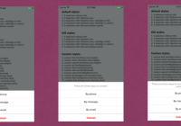
default style:

customized iOS style:

customized other style:

Installation
npm install react-naive-highly-customizable-action-sheet
Usage
1. Import component
import ActionSheet from 'react-naive-highly-customizable-action-sheet' 2. Custom and show
Example 1:
<ActionSheet mainTitle="There are three ways to contact. Please choose one to contact." itemTitles = {["By phone","By message","By email"]} selectionCallbacks = {[this.clickedByPhone,this.clickedByMessage,this.clickedByEmail]} mainTitleTextAlign = 'center' ref={(actionsheet)=>{this.actionsheet = actionsheet}} /> //show ActionSheet showActionSheet(){ this.actionsheet.show(); } //callback 1 clickedByPhone(){ alert('By Phone'); } //callback 2 clickedByMessage(){ alert('By Message'); } //callback 3 clickedByEmail(){ alert('By Email'); }
Example2:
<ActionSheet mainTitle="There are three ways to contact. Please choose one to contact." itemTitles = {["By phone","By message","By email"]} selectionCallbacks = {[this.clickedByPhone,this.clickedByMessage,this.clickedByEmail]} mainTitleTextAlign = 'center' contentBackgroundColor = '#EFF0F1' bottomSpace = {10} cancelVerticalSpace = {10} borderRadius = {5} sideSpace = {6} itemTitleColor = '#006FFF' cancelTitleColor = '#006FFF' ref={(actionsheet)=>{this.actionsheet = actionsheet}} /> 
Props:
-
itemTitles(Array):titles of all selection items -
selectionCallbacks(Array):callbacks of all selection items -
mainTitle(String):main title text -
mainTitleFont(Number):main title text font -
mainTitleColor(String):main title text color -
mainTitleHeight(Number):main title cell height -
mainTitleTextAlign(String):main title text align -
mainTitlePadding(Number):main title padding -
itemTitleFont(Number):item text font -
itemTitleColor(String):item text color -
itemHeight(Number):item cell height -
cancelTitle(String):cancel text,default is 'Cancel' -
cancelTitleFont(Number):cancel text font -
cancelTitleColor(String):cancel text color -
cancelHeight(Number):cancel cell height -
hideCancel(Bool):if hide cancel cell (default is no) -
fontWeight(String):all text fontWeight (default: title and item text fontWeight is 'normal', cancel text fontWeight is 'bold' ) -
titleFontWeight(String):title text fontWeight -
itemFontWeight(String):item text fontWeight -
cancelFontWeight(String):cancel text fontWeight -
contentBackgroundColor(String):all cell background color (default is white) -
titleBackgroundColor(String):title cell background color (default is white) -
itemBackgroundColor(String):item cell background color (default is white) -
cancelBackgroundColor(String):cancel cell background color (default is white) -
itemSpaceColor(String):seperate line color between item cells -
cancelSpaceColor(String):seperate line color between last item cell and cancel cell -
itemVerticalSpace(Number):distance between item cells -
cancelVerticalSpace(Number):distance between last item item cell and cancel cell -
bottomSpace(Number):distance between screen bottom and cancel cell (default is 0) -
sideSpace(Number):distance between content edge and screen edge (default is 0) -
borderRadius(Number):border radius of content (default is 0) -
maskOpacity(Number):opacity of mask (default is 0.3)
Highly customizable


License
All source code is licensed under the MIT License.


