bsWindow
A small javascript module for creating bootstrap 4 modal dialog windows.

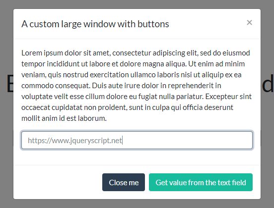
Example
Instead of writing code like this:
<div class="modal" tabindex="-1" role="dialog"> <div class="modal-dialog" role="document"> <div class="modal-content"> <div class="modal-header"> <h5 class="modal-title">Modal title</h5> <button type="button" class="close" data-dismiss="modal" aria-label="Close"> <span aria-hidden="true">×</span> </button> </div> <div class="modal-body"> <p>Modal body text goes here.</p> </div> <div class="modal-footer"> <button type="button" class="btn btn-secondary" data-dismiss="modal">Close</button> </div> </div> </div> </div>…you may just write something like:
bsWindow.show({ title: 'Modal title', message: '<p>Modal body text goes here.</p>', buttons: [ { label: 'Close', action: function(atr) { atr.close(); } } ] });…or even:
bsWindow.alert('Modal body text goes here', 'Title');Usage (module methods)
Alert
A simple alert window, like native javascript alert.
Usage: bsWindow.alert(text, title, cb);.
Where:
text— Message text.title— Optional. Message title.cb— Optional. Callback function, that fired after the dialog will be closed.
Confirm
Another analog of native javascript function confirm.
Usage similar: bsWindow.confirm(text, title, cb);.
The user choice will be passed to the callback attribute as boolean value.
Prompt
And another one analog of native JS function.
Usage: bsWindow.prompt(text, defaultValue, title, cb);.
The user's answer will be passed to callback the same way as it native JS function do (if user cancelled dialog window, there will be null).
More complex modal dialogs
Usage: bsWindow.show(options);.
Where options is an object, containing the following settings (All of them are optional):
title— Window title.message— Window message.animate— Window animation. Defaulttrue.large— Window large width. Defaultfalse.small— Window small width. Defaultfalse.closeable— Window closeable. Defaulttrue.buttons— Array ofbuttonobjects, each of them may have the following settings:label— Label text of button.className— A string that will be added to class attribute of button. Default:btn-secondary.action— Optional. A callback function, that fired when user clicks a button.
onAppear— Callback function, that fired when window did appear.onDisappear— Callback function, that fired when window did disappear.
Every callback function (button action or onAppear/onDisappear) gets object with following properties as attribute:
element— DOM element of dialog window itself.close— A function, implemented to close window, if needed. It will destroy the generated DOM elements of modal dialog.


