react-dropdown 


React Dropdown
Demo: https://trendmicro-frontend.github.io/react-dropdown
Installation
- Install the latest version of react and react-dropdown:
npm install --save react @trendmicro/react-dropdown - At this point you can import
@trendmicro/react-dropdownand its styles in your application as follows:
import Dropdown, { DropdownToggle, DropdownMenu, DropdownMenuWrapper, MenuItem, DropdownButton } from '@trendmicro/react-dropdown'; // Be sure to include styles at some point, probably during your bootstraping import '@trendmicro/react-buttons/dist/react-buttons.css'; import '@trendmicro/react-dropdown/dist/react-dropdown.css';Recommended Setup
Create a common components directory including both Buttons and Dropdown components, as shown below:
components/ Buttons/ index.js Dropdown/ index.js components/Buttons/index.js
import '@trendmicro/react-buttons/dist/react-buttons.css'; export { Button, ButtonGroup, ButtonToolbar } from '@trendmicro/react-buttons';components/Dropdown/index.js
import '@trendmicro/react-dropdown/dist/react-dropdown.css'; import Dropdown from '@trendmicro/react-dropdown'; import '../Buttons'; // Ensure CSS dependency export default Dropdown; export { DropdownToggle, DropdownMenu, DropdownMenuWrapper, MenuItem, DropdownButton } from '@trendmicro/react-dropdown';Then, import Dropdown component in your code:
import Dropdown from './components/Dropdown';Custom Styling
You can make style changes using inline styles or styled-components, and specify propTypes and defaultProps by setting them as properties on the function.
Inline Styles
const CustomDropdownMenu = (props) => ( <Dropdown.Menu {...props} style={{ padding: '2px 0' }} /> ); CustomDropdownMenu.propTypes = Dropdown.Menu.propTypes; CustomDropdownMenu.defaultProps = Dropdown.Menu.defaultProps;Styled Components
const CustomDropdownMenu = styled(Dropdown.Menu)` padding: 2px 0; `; CustomDropdownMenu.propTypes = Dropdown.Menu.propTypes; CustomDropdownMenu.defaultProps = Dropdown.Menu.defaultProps;To increase the CSS specificity of a rule, you can simply repeat a selector, like so:
const CustomMenuItem = styled(MenuItem)` && { a { &:hover { background: ${styleConstants.selectionColor}; } padding: 0 6px; } } `; CustomMenuItem.propTypes = MenuItem.propTypes; CustomMenuItem.defaultProps = MenuItem.defaultProps;Usage
Dropdown
<Dropdown onSelect={(eventKey) => { }} > <Dropdown.Toggle btnStyle="flat" > Toggler </Dropdown.Toggle> <Dropdown.Menu> <MenuItem header>Header</MenuItem> <MenuItem eventKey={1}>link</MenuItem> <MenuItem divider /> <MenuItem header>Header</MenuItem> <MenuItem eventKey={2}>link</MenuItem> <MenuItem eventKey={3} disabled>disabled</MenuItem> <MenuItem eventKey={4} title="link with title" > link with title </MenuItem> <MenuItem eventKey={5} active onSelect={(eventKey) => { alert(`Alert from menu item.\neventKey: ${eventKey}`); }} > link that alerts </MenuItem> </Dropdown.Menu> </Dropdown>Multi-Level Dropdown
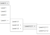
<Dropdown> <Dropdown.Toggle title="Select an option" /> <Dropdown.Menu> <MenuItem> Menu item one </MenuItem> <MenuItem> Menu item two </MenuItem> <MenuItem> Menu item three </MenuItem> <MenuItem divider /> <MenuItem> Menu item four <MenuItem> Second level item one </MenuItem> <MenuItem> Second level item two </MenuItem> <MenuItem> Second level item three <MenuItem> Third level item one </MenuItem> </MenuItem> </MenuItem> </Dropdown.Menu> </Dropdown>Dropdown Menu Wrapper
<Dropdown> <Dropdown.Toggle title="Select an option" /> <Dropdown.MenuWrapper> <SearchFilter /> <Dropdown.Menu> <MenuItem> Menu item one </MenuItem> <MenuItem> Menu item two </MenuItem> <MenuItem> Menu item three </MenuItem> </Dropdown.Menu> </Dropdown.MenuWrapper> </Dropdown>Dropdown Button
<DropdownButton btnSize="xs" title="More" onSelect={(eventKey) => { }} > <MenuItem eventKey={1}>link</MenuItem> <MenuItem eventKey={2}>link</MenuItem> </DropdownButton>API
Properties
Dropdown
| Name | Type | Default | Description |
|---|---|---|---|
| componentClass | element | ButtonGroup | A custom element for this component. |
| dropup | boolean | false | The menu will open above the dropdown button, instead of below it. |
| disabled | boolean | false | Whether or not component is disabled. |
| open | boolean | false | Whether or not the dropdown is visible. |
| autoOpen | boolean | false | Whether to open the dropdown on mouse over. |
| pullRight | boolean | false | Align the menu to the right side of the dropdown toggle. |
| onClose | function(event) | A callback fired when the dropdown closes. | |
| onToggle | function(boolean) | A callback fired when the dropdown wishes to change visibility. Called with the requested open value. | |
| onSelect | function(eventKey, event) | A callback fired when a menu item is selected. | |
| role | string | If 'menuitem', causes the dropdown to behave like a menu item rather than a menu button. | |
| rootCloseEvent | One of: 'click' 'mousedown' | Which event when fired outside the component will cause it to be closed. |
DropdownToggle
| Name | Type | Default | Description |
|---|---|---|---|
| componentClass | element | Button | A custom element for this component. |
| btnSize | One of: 'lg' 'md' 'sm' 'xs' | 'md' | |
| btnStyle | One of: 'default' 'primary' 'emphasis' 'flat' 'link' | 'flat' | |
| noCaret | boolean | false | Whether to prevent a caret from being rendered next to the title. |
| title | node | Title content. | |
| disabled | boolean | false | Whether or not component is disabled. |
DropdownMenu
| Name | Type | Default | Description |
|---|---|---|---|
| componentClass | element | ul | A custom element for this component. |
| onClose | function(event) | A callback fired when the dropdown menu closes. | |
| onSelect | function(eventKey, event) | A callback fired when a menu item is selected. | |
| rootCloseEvent | One of: 'click' 'mousedown' | Which event when fired outside the component will cause it to be closed. |
DropdownMenuWrapper
| Name | Type | Default | Description |
|---|---|---|---|
| componentClass | element | div | A custom element for this component. |
| onClose | function(event) | A callback fired when the dropdown menu closes. | |
| onSelect | function(eventKey, event) | A callback fired when a menu item is selected. | |
| rootCloseEvent | One of: 'click' 'mousedown' | Which event when fired outside the component will cause it to be closed. |
MenuItem
| Name | Type | Default | Description |
|---|---|---|---|
| componentClass | element | Button | A custom element for this component. |
| active | boolean | false | Highlight the menu item as active. |
| disabled | boolean | false | Disable the menu item, making it unselectable. |
| divider | boolean | false | Style the menu item as a horizontal rule, providing visual separation between groups of menu items. |
| eventKey | any | Value passed to the onSelect handler, useful for identifying the selected menu item. | |
| header | boolean | false | Style the menu item as a header label, useful for describing a group of menu items. |
| onClick | function(event) | Callback fired when the menu item is clicked, even if it is disabled. | |
| open | boolean | false | Whether or not the dropdown submenu is visible. |
| onClose | function(event) | A callback fired when the dropdown menu closes. | |
| onSelect | function(eventKey, event) | A callback fired when a menu item is selected. | |
| rootCloseEvent | One of: 'click' 'mousedown' | Which event when fired outside the component will cause it to be closed. |
DropdownButton
| Name | Type | Default | Description |
|---|---|---|---|
| componentClass | element | ButtonGroup | A custom element for this component. |
| dropup | boolean | false | The menu will open above the dropdown button, instead of below it. |
| disabled | boolean | false | Whether or not component is disabled. |
| pullRight | boolean | false | Align the menu to the right side of the dropdown toggle. |
| open | boolean | false | Whether or not the dropdown is visible. |
| onClose | function(event) | A callback fired when the dropdown closes. | |
| onToggle | function(boolean) | A callback fired when the dropdown wishes to change visibility. Called with the requested open value. | |
| onSelect | function(eventKey, event) | A callback fired when a menu item is selected. | |
| role | string | If 'menuitem', causes the dropdown to behave like a menu item rather than a menu button. | |
| rootCloseEvent | One of: 'click' 'mousedown' | Which event when fired outside the component will cause it to be closed. | |
| btnSize | One of: 'lg' 'md' 'sm' 'xs' | 'md' | |
| btnStyle | One of: 'default' 'primary' 'emphasis' 'flat' 'link' | 'flat' | |
| title | node | Title content. | |
| noCaret | boolean | false | Whether to prevent a caret from being rendered next to the title. |
License
MIT


