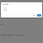
ui.bootstrap.progressCircle
Circular progress bar for AngularJS Bootstrap. Demo
Usage
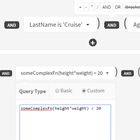
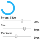
$scope.progress = 0.8;<progress-circle ng-model="progress"></progress-circle>| Attribute | Description | Required | Default |
|---|---|---|---|
| ngModel | [min] to [max] | true | |
| min | 0 | false | 0 |
| max | 1 | false | 1 |
| thickness | Thickness bar | false | 10 |
| offset | Degree offset, starting at the left middle going clockwise. | false | 90 |
Style the bar by assigning a class or globally with the progress-circle class.
.progress-circle path { fill: #29B6F6; } Variant for a Solid Object
If a solid is needed instead of a path the code below will solve that. This version required a little trigonometry, which I have not done since high school so it might be a bit rough. One difference is that offset defaults to 270.