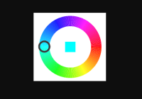
React Circular Color picker 

A circular color picker component also named color-wheel performed with react and pure svg. Mobile compatible.


Installation
npm install react-circular-colorUsage
import React, { Component } from 'react'; import CircularColor from 'react-circular-color'; class ExampleComponent extends Component { handleColorChange(color) { console.log(color); // it will be string with a color hash e.g. #1c1c1c } render() { return ( <CircularColor size={200} onChange={this.handleColorChange} /> ); } }Customized elements
import React, { Component } from 'react'; import ColorPicker from 'react-color-picker'; export default class CustomizedColorPicker extends Component { renderHandle = ({ onHandleDown, cx, cy, handleRadius }) => { return( <svg x={cx-10} y={cy-10} width={20} height={20} > <polygon points={'10,0 0,20 20,20'} fill="#fff" /> </svg> ); } renderRect = ({ color, x, y }) => { return ( <circle cx={x + 14} cy={y + 14} r="14" fill={color} /> ); } render() { return ( <ColorPicker renderRect={this.renderRect} centerRect={true} renderHandle={this.renderHandle} /> ); } } Props
| Name | Description |
|---|---|
size | Numeric size of the element in pixels. Default: 200 |
numberOfSectors | Number of wheel's sectors. Default: 360 |
className | Classes to apply to the svg element |
centerRect | Whether to display central rectangle with picked color. Default: false. |
onChange | Fired when the color is changing |
renderRect | Use it to customize how the central rectangle with picked color is rendered. Function recieves one object with color, x & y keys |
renderHandle | Use it to customize how the circular color handle is rendered. Function recieves one object with cx, cy, onHandleDown & handleRadius keys |
color | String value of color. Default:#f2ff00 |
Development
To run demo locally on localhost:8080:
npm install npm startTest
To run test type:
npm run test


