rn-tooltip
Simple, lightwweight and blazing fast react native tooltip

Expo App if you want to try it out: https://expo.io/@andreixoc/RNTooltipTester
Code for the Expo app is here: https://github.com/andreiCalazans/rnTooltipTester
Install
yarn add rn-tooltip
or
npm install rn-tooltip --save
Usage
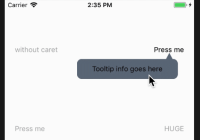
import { Text } from 'react-native'; import Tooltip from 'rn-tooltip'; ... <Tooltip popover={<Text>Info here</Text>}> <Text>Press me</Text> </Tooltip>Props
backgroundColorcontainerStyleheighthighlightColoronCloseonOpenpointerColorpopovertoggleOnPresswidthwithOverlayoverlayColorwithPointer
Reference
backgroundColor
sets backgroundColor of the tooltip and pointer.
| Type | Default |
|---|---|
| string | #617080 |
containerStyle
Passes style object to tooltip container
| Type | Default |
|---|---|
| object (style) | inherited styling |
height
Tooltip container height. Necessary in order to render the container in the correct place. Pass height according to the size of the content rendered inside the container.
| Type | Default |
|---|---|
| number | 40 |
highlightColor
Color to highlight the item the tooltip is surrounding.
| Type | Default |
|---|---|
| string | transparent |
onClose
function which gets called on closing the tooltip.
| Type | Default |
|---|---|
| function | () => {} |
onOpen
function which gets called on opening the tooltip.
| Type | Default |
|---|---|
| function | () => {} |
pointerColor
Color of tooltip pointer, it defaults to the backgroundColor if none is passed .
| Type | Default |
|---|---|
| string | backgroundColor |
popover
Component to be rendered as the display container.
| Type | Default |
|---|---|
| React.Element | null |
toggleOnPress
Flag to determine to toggle or not the tooltip on press.
| Type | Default |
|---|---|
| boolean | true |
width
Tooltip container width. Necessary in order to render the container in the correct place. Pass height according to the size of the content rendered inside the container.
| Type | Default |
|---|---|
| number | 150 |
withOverlay
Flag to determine whether or not dislay overlay shadow when tooltip is open.
| Type | Default |
|---|---|
| boolean | true |
overlayColor
Sets backgroundColor of the overlay.
| Type | Default |
|---|---|
| string | rgba(250, 250, 250, 0.70) |
withPointer
Flag to determine whether or not dislay pointer.
| Type | Default |
|---|---|
| boolean | true |
MIT Licensed


