jquery.sunslide
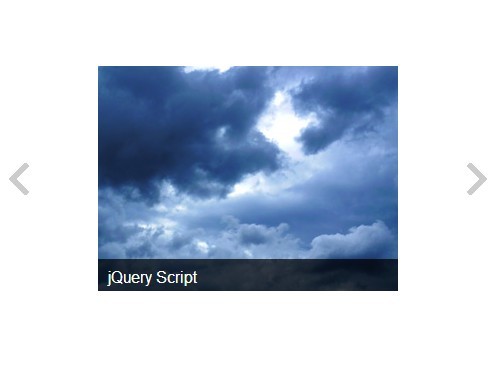
A very basic, jQuery-based, responsive image slider/carousel with captions and aspect ratio support for variable sized images.
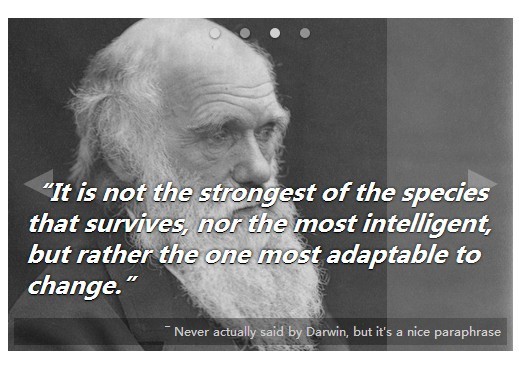
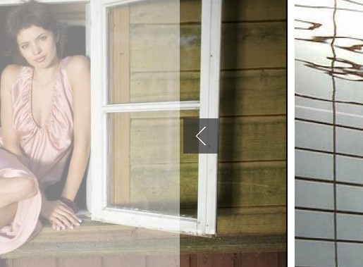
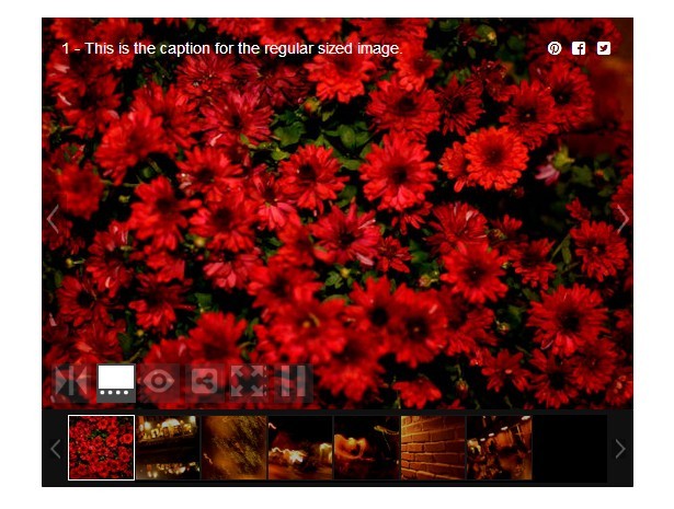
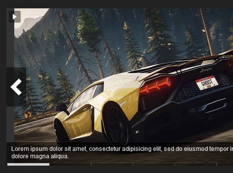
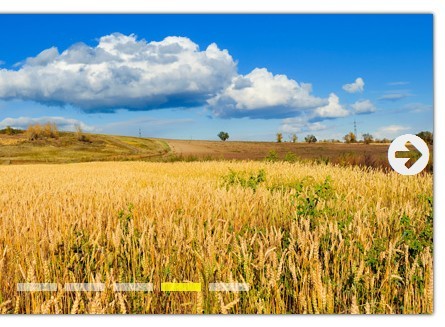
Captions are pulled from the alt parameter of the img tag.
SVGs are supported, and like images, must include a pixel width and height attribute. Captions are pulled from the SVG’s <desc> or <title> tags.
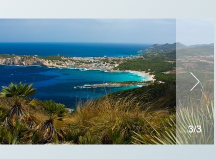
Sample
<head> <!-- ... unrelated content ... --> <link rel="stylesheet" href="/path/to/jquery.sunslide.css"> <!-- ... unrelated content ... --> </head> <body> <!-- ... unrelated content ... --> <ul class="sunslide"> <li><img src="images/cats-0.jpg" alt="Cats 0 caption" width="900" height="506"></li> <li><svg width="900" height="506"><title>Cats 1 caption</title><!-- awesome svg cat code --></svg></li> <li><img src="images/cats-2.jpg" alt="Cats 2 caption" width="640" height="480"></li> <li><img src="images/cats-3.jpg" alt="Cats 3 caption" width="900" height="506"></li> <li><img src="images/cats-4.jpg" alt="Cats 4 caption" width="1000" height="500"></li> </ul> <!-- ... unrelated content ... --> <script src="/path/to/jquery.min.js"></script> <script src="/path/to/jquery.sunslide.min.js"></script> <script> !(function ($) { // These options are the default options for the plugin. // They are only included for reference. var options = { auto: true, captions: true, nav: true, nextText: "→", play: true, pause: true, prevText: "←", ratio: "first", stopOnNav: true, timeout: 5000 }; $('.sunslide').sunslide(options); })(jQuery); </script> </body>A samples page is also included.
Dependencies and Assumptions
The plugin should work with jQuery 1.9 or later.
Each slide must contain only <img> or <svg> tag which should include both a width and height attribute.
<img> tags must contain the alt attribute (which is already required for acessibility). <svg> tags must contain a <title> and/or <desc> tag for captions.
Options
auto
Automatically transition to the next slide via a timer?
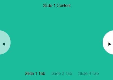
type: boolean default: true options: true -- Automatically transition to the next slide false -- Do not automatically transition to the next slide captions
Use the image alt text as the slider caption?
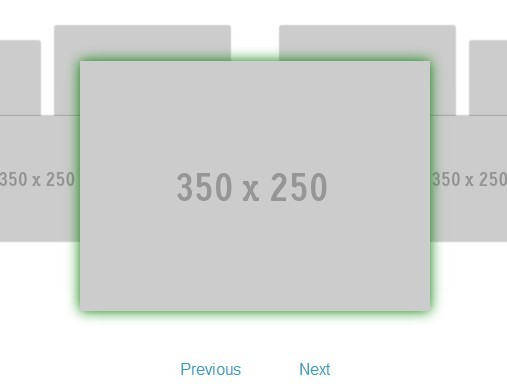
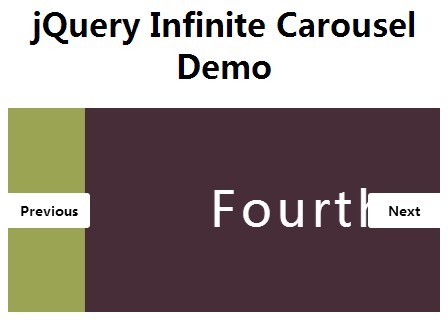
type: boolean default: true options: true -- Add captions false -- Do not add captions nav
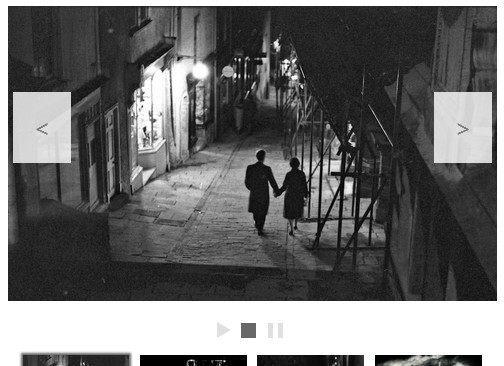
Add the previous and next slide navigation links? This is independent of the play option.
type: boolean default: true options: true -- show navigation links false -- do not show navigation links nextText
Link text for the next slide nav link.
type: string default: "→" dependency: nav = true play
Add a play/pause button to control the automatic slide transitions? This is independent of the nav option.
type: boolean default: true options: true -- Add the play/pause button false -- Do not add the play/pause button pause
Pause the automatic slide transitions when hovering over the slider with the mouse?
type: boolean default: true options: true -- Pause on hover false -- Do not pause on hover dependency: auto = true prevText
Link text for the previous slide nav link.
type: string default: "←" dependency: nav = true ratio
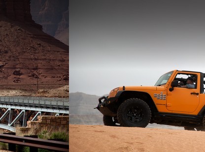
Base the aspect ratio for the whole container to the smallest ratio (min), largest ratio (max), or the apsect ratio of the first slide (first).
type: string default: 'first' options: 'first' -- First slide’s aspect ratio 'min' -- Smallest aspect ratio 'max' -- Largest aspect ratio stopOnNav
Stop the auto slide transition once any nav link is clicked? Once stopped, it can only be restarted with the play/pause button if the play option is true.
type: boolean default: true options: true -- Stop the auto slide transition false -- Do not stop the auto slide transition dependency: auto = true, nav = true timeout
Time, in milliseconds, between auto slide transitions.
type: integer default: 5000 dependency: auto = true License
Released under the MIT license - http://opensource.org/licenses/MIT