ng2-bs3-modal 


Angular (2+) Bootstrap 3 Modal Component
Demo
http://dougludlow.github.io/ng2-bs3-modal/
Dependencies
ng2-bs3-modal depends on bootstrap which depends on jquery. You'll need to include both scripts before ng2-bs3-modal or somehow make them available globally, depending on your build system. Example:
npm install jquery bootstrap@^3.3.7./jquery.ts
import * as $ from 'jquery'; window['jQuery'] = window['$'] = $;./main.ts
import './jquery'; import 'bootstrap/js/modal'; // or just 'bootstrap' import 'bootstrap/dist/css/bootstrap.css'; // optionalInstall
npm
npm install --save ng2-bs3-modalyarn
yarn add ng2-bs3-modalThen include the module in the imports collection of your app's module:
import { NgModule } from '@angular/core'; import { BsModalModule } from 'ng2-bs3-modal'; @NgModule({ imports: [ BsModalModule ] ... }) export class MyAppModule { }API
BsModalComponent
Inputs
-
animation: boolean, default:trueSpecify
falseto simply show the modal rather than having it fade in/out of view. -
backdrop: string | boolean, default:trueSpecify
'static'for a backdrop which doesn't close the modal on click orfalsefor no backdrop. -
keyboard: boolean, default:trueCloses the modal when escape key is pressed. Specify
falseto disable. -
size: string, default:undefinedSpecify
'sm'for small and'lg'for large. -
cssClass: string, default:undefinedApplies the given class to the modal. Can be used to styles the modal; for example, giving it a custom size.
Outputs
-
onShow: EventEmitter<Event>Emits when the
show.bs.modalevent is triggered, just before the modal is shown. CallEvent.preventDefault()to cancel the modal from showing. -
onHide: EventEmitter<BsModalHideEvent>Emits when the
hide.bs.modalevent is triggered, just before the modal is hidden. CallBsModalHideEvent.event.preventDefault()to cancel the modal from hiding. -
onClose: EventEmitter<any>Emits when
ModalComponent.close()is called. Will emit whatever was passed intoModalComponent.close(). -
onDismiss: EventEmitter<BsModalHideType>Emits when
ModalComponent.dismiss()is called, or when the modal is dismissed with the keyboard or backdrop. Returns aBsModalHideTypethat can be used to determine how the modal was dismissed. -
onOpen: EventEmitterEmits when
ModalComponent.open()is called.
Methods
-
open(size?: string): PromiseOpens the modal. Size is optional. Specify
'sm'for small and'lg'for large to override size. Returns a promise that resolves when the modal is completely shown. -
close(value?: any): Promise<any>Closes the modal. Causes
onCloseto be emitted. Returns a promise that resolves the value passed toclosewhen the modal is completely hidden. -
dismiss(): PromiseDismisses the modal. Causes
onDismissto be emitted. Returns a promise that resolves when the modal is completely hidden.
BsModalHeaderComponent
Inputs
-
showDismiss: boolean, default:falseShow or hide the close button in the header. Specify
trueto show.
BsModalFooterComponent
Inputs
-
showDefaultButtons: boolean, default:falseShow or hide the default 'Close' and 'Dismiss' buttons in the footer. Specify
trueto show. -
closeButtonLabel: string, default:'Close'Change the label in the default 'Close' button in the footer. Has no effect if showDefaultButtons aren't set.
-
dismissButtonLabel: string, default:'Dismiss'Change the label in the default 'Dismiss' button in the footer. Has no effect if showDefaultButtons aren't set.
BsModalService
Methods
-
dismissAll(): voidDismiss all open modals. Inject the
BsModalServiceinto a componet/service to use.
Example Usage
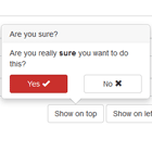
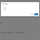
Default modal
<button type="button" class="btn btn-default" (click)="modal.open()">Open me!</button> <bs-modal #modal> <bs-modal-header [showDismiss]="true"> <h4 class="modal-title">I'm a modal!</h4> </bs-modal-header> <bs-modal-body> Hello World! </bs-modal-body> <bs-modal-footer [showDefaultButtons]="true"></bs-modal-footer> </bs-modal>
Static modal
This will create a modal that cannot be closed with the escape key or by clicking outside of the modal.
<bs-modal #modal [keyboard]="false" [backdrop]="'static'"> <bs-modal-header [showDismiss]="false"> <h4 class="modal-title">I'm a modal!</h4> </bs-modal-header> <bs-modal-body> Hello World! </bs-modal-body> <bs-modal-footer [showDefaultButtons]="true"></bs-modal-footer> </bs-modal>Use custom buttons in footer
<bs-modal #modal> <bs-modal-header> <h4 class="modal-title">I'm a modal!</h4> </bs-modal-header> <bs-modal-body> Hello World! </bs-modal-body> <bs-modal-footer> <button type="button" class="btn btn-default" data-dismiss="modal" (click)="modal.dismiss()">Cancel</button> <button type="button" class="btn btn-primary" (click)="modal.close()">Ok</button> </bs-modal-footer> </bs-modal>
Opening and closing the modal from a parent component
import { Component, ViewChild } from '@angular/core'; import { BsModalComponent } from 'ng2-bs3-modal'; @Component({ selector: 'parent-component', template: ` <bs-modal #myModal> ... </bs-modal> ` }) export class ParentComponent { @ViewChild('myModal') modal: BsModalComponent; close() { this.modal.close(); } open() { this.modal.open(); } }Opening the modal when the parent component loads
import { Component, ViewChild, AfterViewInit } from '@angular/core'; import { BsModalComponent } from 'ng2-bs3-modal'; @Component({ selector: 'parent-component', template: ` <bs-modal #myModal> ... </bs-modal> ` }) export class ParentComponent implements AfterViewInit { @ViewChild('myModal') modal: BsModalComponent; ngAfterViewInit() { this.modal.open(); } }Note: ViewChild doesn't resolve the modal property until AfterViewInit. OnInit is too early and will result in an "undefined" error.
Multiple modals in a component
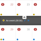
import { Component, ViewChild } from '@angular/core'; import { BsModalComponent } from 'ng2-bs3-modal'; @Component({ selector: 'parent-component', template: ` <bs-modal #myFirstModal> ... </bs-modal> <bs-modal #mySecondModal> ... </bs-modal> ` }) export class ParentComponent { @ViewChild('myFirstModal') modal1: BsModalComponent; @ViewChild('mySecondModal') modal2: BsModalComponent; ... }Modal with a custom size
import { Component, ViewChild } from '@angular/core'; import { BsModalComponent } from 'ng2-bs3-modal'; @Component({ selector: 'parent-component', styles: ['>>> .modal-xl { width: 1100px; }'], template: ` <bs-modal cssClass="modal-xl" #modal> ... </bs-modal> ` }) export class ParentComponent { ... }Note: Angular2 emulates the shadow dom by prefixing component styles with a unique identifier. Because the modal is attached to the body tag, it doesn't pick up these styles. You will need to add the /deep/ or >>> selector in order for the style to take effect. See Component Styles.
Modal in NgFor
import { Component, ViewChildren } from '@angular/core'; import { BsModalComponent } from 'ng2-bs3-modal'; @Component({ selector: 'parent-component', template: ` <button type="button" class="btn btn-default" (click)="modal.open()">Open me!</button> <div *ngFor="let item in items; trackBy: item.id"> <bs-modal #modal> ... </bs-modal> </div> ` }) export class ParentComponent { @ViewChildren(BsModalComponent) modals: QueryList<BsModalComponent>; // How to access a collection of modals ... }Note: If you are updating items asynchronously, make sure you are using trackBy in the ngFor directive so that Angular doesn't teardown and redraw the elements each time the collection is changed. See NgFor Directive for more details.
Modal with validation
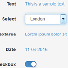
<bs-modal #validationModal> <form #modalForm="ngForm"> <bs-modal-header [showDismiss]="true"> <h4 class="modal-title">I'm a modal!</h4> </bs-modal-header> <bs-modal-body> <div class="form-group"> <label for="firstName">First Name</label> <input type="text" class="form-control" required [(ngModel)]="firstName" name="firstName" id="firstName"> </div> <div class="form-group"> <label for="lastName">Last Name</label> <input type="text" class="form-control" required [(ngModel)]="lastName" name="lastName" id="lastName"> </div> </bs-modal-body> <bs-modal-footer> <button type="button" class="btn btn-default" data-dismiss="modal" (click)="validationModal.dismiss()">Cancel</button> <button type="button" class="btn btn-primary" [disabled]="!modalForm.valid" (click)="validationModal.close()">Save</button> </bs-modal-footer> </form> </bs-modal>Autofocus on a textbox when modal is opened
<bs-modal #modal> <bs-modal-header> <h4 class="modal-title">I'm a modal!</h4> </bs-modal-header> <bs-modal-body> <div class="form-group"> <label for="textbox">I'm a textbox!</label> <input autofocus type="text" class="form-control" id="textbox"> </div> </bs-modal-body> <bs-modal-footer [showDefaultButtons]="true"></bs-modal-footer> </bs-modal>Building
git clone https://github.com/dougludlow/ng2-bs3-modal.git yarn yarn buildRunning
yarn startNavigate to http://localhost:4200/ in your browser.
Testing
yarn test:libBugs/Contributions
Report all bugs and feature requests on the issue tracker.
Contributions are welcome! Feel free to open a pull request.