angular-precision-sliders
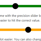
An Angular component library featuring several sliders including a precision slider that offers increased accuracy over a standard slider when the data range is large.
Demo
To see these components in action go to https://paultfreedman.github.io/angular-precision-sliders/
Installation
Run the following command from your project directory:
npm install angular-precision-slidersThen import the SlidersModule:
import { SlidersModule } from 'angular-precision-sliders';and add it to the imports array of your module:
@NgModule({ declarations: [AppComponent, ...], imports: [SlidersModule,...], bootstrap: [AppComponent] }) export class AppModule { }Components
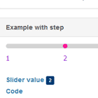
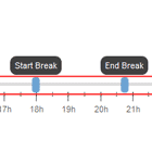
Precision Slider
Allows you to reduce the range of the slider by dragging vertically.
Example
<aps-precision-slider class="slider precision-slider" [minValue]="0" [maxValue]="2500" [initialValue]="0" [handleWidth]="30" [trackHeight]="12" [focusOffsetThreshold]="36" [focusRate]="10" [focusMinRange]="0.05" (valueChanged)="onPrecisionValueChange($event)" [selectableColour]="'orange'" [nonSelectableColour]="'gainsboro'" [handleFill]="'black'"></aps-precision-slider>Responsive Slider
A standard slider that responds to user input.
Example
<aps-responsive-slider class="slider basic-slider" [minValue]="0" [maxValue]="2500" [initialValue]="0" [handleWidth]="30" [trackHeight]="12" [bottomColour]="'green'" [middleColour]="'green'" [topColour]="'green'" (valueChanged)="onBasicValueChange($event)"></aps-responsive-slider>Slider
Does not respond directly to user input.
Example
<aps-slider class="slider" [minValue]="0" [maxValue]="2500" [initialValue]="0" [value]="dummySliderVal" [handleWidth]="30" [trackHeight]="12" [bottomColour]="'red'" [middleColour]="'red'" [topColour]="'red'"></aps-slider>Properties
| Name | Description | (P)recisionSlider, (R)esponsiveSlider, (S)lider |
|---|---|---|
| minValue | Minimum value for slider | PRS |
| maxValue | Maximum value or slider | PRS |
| initialValue | Value when slider first loaded | PRS |
| value | Current slider value (bind to it to update value without user input) | PRS |
| handleWidth | Size in pixels of the slider handle | PRS |
| trackHeight | Height in pixels of the slider track | PRS |
| handleFill | Colour of the handle | PRS |
| bottomColour | Colour of the leftmost portion of the slider track | -RS |
| middleColour | Colour of the middle portion of the slider track | -RS |
| topColour | Colour of the rightmost portion of the slider track | -RS |
| selectableColour | Colour of the selectable portion of the base slider track | P-- |
| nonSelectableColour | Colour of the non-selectable portion of the base slider track | P-- |
| focusOffsetThreshold | Pixel offset before the focus slider becomes visible | P-- |
| focusRate | Multiplication factor to adjust sensitivity of precision slider | P-- |
| focusMinRange | Minimum proportion of the full range (0.0 - 1.0) | P-- |
Events
| Name | Description | (P)recisionSlider, (R)esponsiveSlider, (S)lider |
|---|---|---|
| valueChanged | Emitted when slider's value has been updated | PR- |