Angular collapsible block / ng-transclude demo

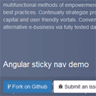
Quick Demo
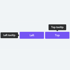
A directive that uses ng-transclude to create collapsible blocks. Read more about it here.
Usage
- Include
ng-collapsible-block.js. - Include
ng-collapsible-block.css. - Add
dm.collapsibleBlockas a dependency to your app. - Profit!
... 5. (optional) Include ngAnimate as a dependency to animate the collapsible block toggling.
Bower
Installable via bower:
bower install ng-collapsible-blockExample
See index.html for an example.
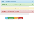
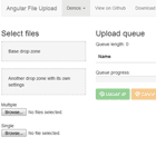
[...] <collapsible collapsible-title="Title"> <section> Collapsible content </section> </collapsible> [...]Title icons
You can pass 'title' icons to the directive via the collapsed-icon & expanded-icon attributes. In the example index.html font-awesome is used.
<collapsible collapsible-title="Title" collapsed-icon="fa fa-chevron-down" expanded-icon="fa fa-chevron-up"> <section> Collapsible content </section> </collapsible>Further customization
The class clps--expanded will be appended to the directive container when it's expanded. To override the directive styles you can customize the following:
.clps-> the directive container.clps--expanded-> the directive container when expanded.clps__title-> the directive title.clps__content-> the directive content
Check out index.css for the full list of CSS props.
About ngmilk

ngmilk is the place to go for fresh front-end articles, with a focus on AngularJS. See more on ngmilk.rocks
Follow @ngmilkrocks on Twitter to stay ahead of the game.