Vue Advanced Cropper
The advanced library that gives you opportunity to create your own croppers suited for any website design

WARNING: This library is in beta test stage. API can be changed in the future.

Install
npm install --save vue-advanced-cropperyarn add vue-advanced-cropperIf you would to use CDN read the corresponding documentation section
Usage
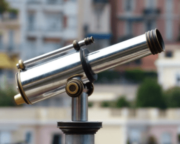
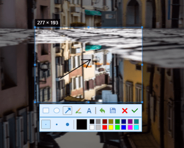
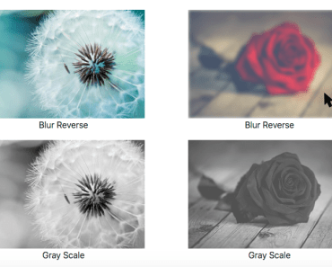
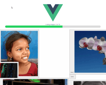
import Vue from 'vue' import { Cropper } from 'vue-advanced-cropper' new Vue({ el: '#app', data: { img: 'https://images.pexels.com/photos/226746/pexels-photo-226746.jpeg' }, methods: { change({coordinates, canvas}) { console.log(coordinates, canvas) } }, components: { Cropper } })<div id="app"> <cropper classname="cropper" :src="img" :stencilProps="{ aspectRatio: 10/12 }" @change="change" ></cropper> </div>/* Maybe you need to set the limits for the cropper sizes or its container sizes otherwise a cropping image will try to fill all available space */ .cropper { height: 600px; background: #DDD; } Cropper
| Prop | Type | Description | Default |
|---|---|---|---|
| src | String | The cropping image (link / base64) | |
| stencilComponent | String, Object | The stencil component | RectangleStencil |
| stencilProps | Object | The props for the stencil component | {} |
| classname | String | The optional classname for the root cropper block | |
| imageClassname | String | The optional classname for the cropping image | |
| areaClassname | String | The optional classname for the area. | |
| backgroundClassname | String | The optional classname for the background under the image | |
| debounce | String, Number | The time before change event will be emitted after changes (ms) | 500 |
| minWidth | String, Number | The minimum width of the stencil (percents) | 10 |
| minHeight | String, Number | The minimum height of the stencil (percents) | 10 |
| maxWidth | String, Number | The maximum width of the stencil (percents) | 10 |
| maxHeight | String, Number | The maximum height of the stencil (percents) | 10 |
| defaultSize | Function | The function that returns the default size of the stencil | core.defaultSize |
| defaultPosition | Function | The function that returns the default position of the stencil | core.defaultPosition |
| areaSize | Function | The function that determines the area size | core.areaSize |
| resizeAlgorithm | Function | The function that determines the resize algorithm | core.resize |
| moveAlgorithm | Function | The function that determines the move algorithm | core.move |
| Event | Description |
|---|---|
| change | Invoked on changing of a stencil position / size, after mounting the component and on an image changing |
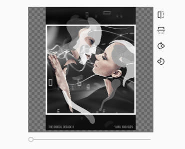
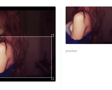
RectangleStencil
| Prop | Type | Description | Default |
|---|---|---|---|
| aspectRatio | Number, String, | The aspect ratio | |
| minAspectRatio | Number, String, | The minimum aspect ratio | |
| maxAspectRatio | Number, String, | The maximum aspect ratio | |
| classname | String, | The classname for root block of the stencil component | |
| previewClassname | String, | The classname for the preview component | |
| boundingBoxClassname | String, | The classname for the bouding box component | |
| handlerComponent | String,Object | The handler component | |
| handlers | Object, | The object of handlers that should be visible or hidden. | |
| handlersClassnames | Object, | The object of custom handler classnames | |
| lineComponent | String,Object | The handler component | |
| lines | Object, | The object of lines that should be visible or hidden. | |
| linesClassnames | Object, | The object of custom line classnames |


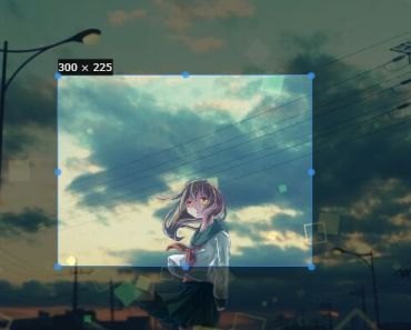
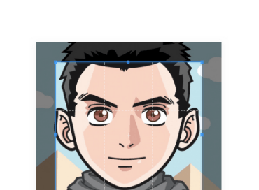