react-accessible-accordion 


Demo
Usage
First, grab the package from npm:
npm install --save react-accessible-accordionThen, import the editor and use it in your code. Here is a basic example:
import React from 'react'; import { Accordion, AccordionItem, AccordionItemHeading, AccordionItemButton, AccordionItemPanel, } from 'react-accessible-accordion'; // Demo styles, see 'Styles' section below for some notes on use. import 'react-accessible-accordion/dist/fancy-example.css'; export default function Example() { return ( <Accordion> <AccordionItem> <AccordionItemHeading> <AccordionItemButton> What harsh truths do you prefer to ignore? </AccordionItemButton> </AccordionItemHeading> <AccordionItemPanel> <p> Exercitation in fugiat est ut ad ea cupidatat ut in cupidatat occaecat ut occaecat consequat est minim minim esse tempor laborum consequat esse adipisicing eu reprehenderit enim. </p> </AccordionItemPanel> </AccordionItem> <AccordionItem> <AccordionItemHeading> <AccordionItemButton> Is free will real or just an illusion? </AccordionItemButton> </AccordionItemHeading> <AccordionItemPanel> <p> In ad velit in ex nostrud dolore cupidatat consectetur ea in ut nostrud velit in irure cillum tempor laboris sed adipisicing eu esse duis nulla non. </p> </AccordionItemPanel> </AccordionItem> </Accordion> ); }Styles
We strongly encourage you to write your own styles for your accordions, but we've published the styles used on our demo page to help you get up and running:
import 'react-accessible-accordion/dist/fancy-example.css';We recommend that you copy them into your own app and modify them to suit your needs, particularly if you're using your own classNames.
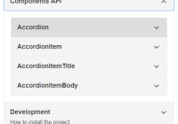
Component API
Accordion
allowMultipleExpanded : boolean [optional, default: false]
Don't autocollapse items when expanding other items.
allowZeroExpanded : boolean [optional, default: false]
Allow the only remaining expanded item to be collapsed.
preExpanded: string[] [optional, default: []]
Accepts an array of strings and any AccordionItem whose uuid prop matches on of these strings will be expanded on mount.
className : string [optional, default: 'accordion']
Class(es) to apply to element.
onChange : (string[]) => void [optional]
Callback which is invoked when items are expanded or collapsed. Gets passed uuids of the currently expanded AccordionItems.
AccordionItem
className : string [optional, default: accordion__item]
Class(es) to apply to element.
uuid : string|number [optional]
Recommended for use with onChange. Will be auto-generated if not provided.
AccordionItemHeading
className : string [optional, default: 'accordion__heading']
Class(es) to apply to the 'heading' element.
aria-level : number [optional, default: 3]
Semantics to apply to the 'heading' element. A value of 1 would make your heading element hierarchically equivalent to an <h1> tag, and likewise a value of 6 would make it equivalent to an <h6> tag.
AccordionItemButton
className : string [optional, default: 'accordion__button']
Class(es) to apply to the 'button' element.
AccordionItemPanel
className : string [optional, default: 'accordion__panel']
Class(es) to apply to element.
AccordionItemState
children : ({ expanded: boolean, disabled: boolean }): JSX.Element [required]
Helpers
resetNextUuid : (): void
Resets the internal counter for Accordion items' identifiers (including id attributes). For use in test suites and isomorphic frameworks.
Accessibility Best-Practice
Authoring an 'accordion' component to the WAI ARIA spec can be complex, but React Accessible Accordion does most of the heavy lifting for you, including:
- Applying appropriate aria attributes (
aria-expanded,aria-controls,aria-disabled,aria-hiddenandaria-labelledby). - Applying appropriate
roleattributes (button,heading,region). - Applying appropriate
tabindexattributes. - Applying keyboard interactivity ('space', 'end', 'tab', 'up', 'down', 'home' and 'end' keys).
However, there's still a couple of things you need to keep in mind to remain spec-compliant:
- Only ever use phrasing content inside of your
AccordionItemHeadingcomponent. If in doubt, use text only. - Always provide an
aria-levelprop to yourAccordionItemHeadingcomponent, especially if you are nesting accordions. This attribute is a signal used by assistive technologies (eg. screenreaders) to determine which heading level (ie.h1-h6) to treat your heading as.
If you have any questions about your implementation, then please don't be afraid to get in touch via our issues.
FAQs
Which design patterns does this component aim to solve?
Those described by the WAI ARIA spec's description of an 'accordion':
An accordion is a vertically stacked set of interactive headings that each contain a title, content snippet, or thumbnail representing a section of content. The headings function as controls that enable users to reveal or hide their associated sections of content. Accordions are commonly used to reduce the need to scroll when presenting multiple sections of content on a single page.
Which design patterns does this component NOT aim to solve?
Components which are "accordion-like" but do not match the WAI ARIA spec's description, as written above. By "accordion-like", we mean components which have collapsible items but require bespoke interactive mechanisms in order to expand, collapse and 'disable' them. This includes (but is not limited to) multi-step forms, like those seen in many cart/checkout flows, which we believe require (other) complex markup in order to be considered 'accessible'.
If you believe that you have a valid use-case for 'disabled' items, or items which require manual 'expanded' state-management, then please let us know - we're always open for critical (but polite) feedback. Otherwise, we don't plan on implementing this functionality in the near future.
How do I disable an item?
See "Which design patterns does this component NOT aim to solve?".
How do I manually control the expanded state of an item?
See "Which design patterns does this component NOT aim to solve?". You may use the 'preExpanded' prop to set the initial expanded state, but it may not be controlled manually thereafter.
Browser Support
Supported browser / device versions:
| Browser | Device/OS | Version |
|---|---|---|
| Mobile Safari | iOS | latest |
| Chrome | Android | latest |
| IE | Windows | 11 |
| MS Edge | Windows | latest |
| Chrome | Desktop | latest |
| Firefox | Desktop | latest |
| Safari | OSX | latest |


